Grand Duo
The Fryderic Chopin Institute
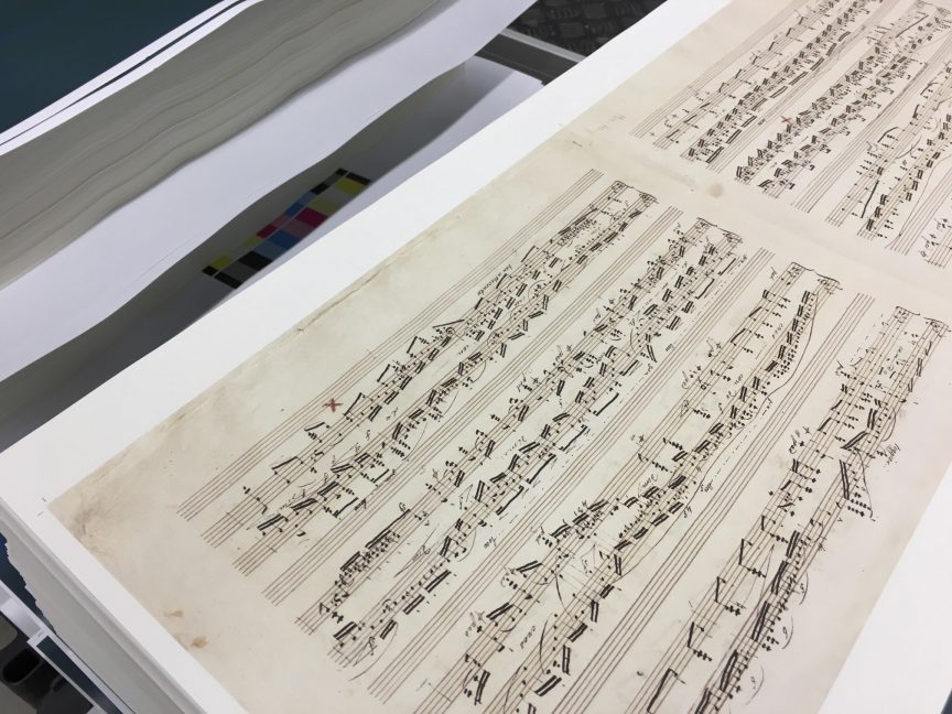
I’ve been making facsimile prints since the first half of 2015. It turned out quickly that this is one of the most demanding printing projects I’ve encountered. It was never about hitting the colour – it is relatively uncomplicated. Finally, the point of the realization was the look&feel of the print, its naturalness of reproduction of pen strokes and discolouration of the original.
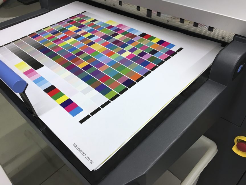
Each print is different. Each one requires a huge amount of attention. The implementation is in two stages. In the first step, I receive approved proofs made in pigmented technology with an extended gamut. Well, on the one hand, it is the best of the commercially available forms of the accepted output, and on the other, equating with it is a challenge at best. Luckily, this is also the reason for my work. Pigment printing with 3 gray levels and halftones in C and M channels means that it requires a lot of treatments to be leveled with it.
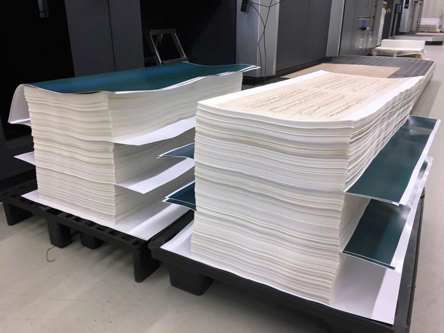
I use various types of screening depending on the nature of the reproduction. In addition, I repeatedly use a multi-steps method of generating black depending on the brightness and colour saturation of the image. Thanks to this, I manage to obtain the virtually screenless print for the background and sharp and at the same time natural shapes of sketched notes and staves. The biggest challenge was the printing of the “Grand Duo Concertant”. It consisted of 6 sheets, which each not only printed in two passes – each page separately – but also with diametrically different settings. The substrate on which the print was made is relatively thin and slightly transparent. This, in turn, makes that one page have a color impact on the other. Reproductions are an example of works in which the dry colourimetric evaluation is absolutely insufficient. Here, the basis is simply eye appeal!
I was in charge of: separations, screening & printing,
Catergory: print,
Press: HP Indigo 10000, CMYK,
Volume: 800 copies.


