
photography . reproductions . albums . portfolios . proofs
Good print requires proper bounding or a frame. In case of a portfolio it will be precise art of book boundary. For larger volumes certain automation will be required. This part is nor trivial and if I can’t do it in person, then for sure I will oversee each step at a time. After all it’s a great pleasure to see a book come to live.
Sometime good print is one and only, unprocessed sheet, but a proper one so that it could be treated as a proof for large volume print house. And before that will confirm colour and layout for a graphic designer.
photography & albums
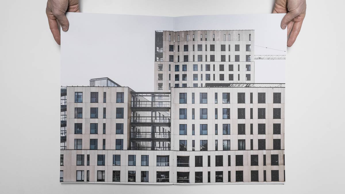
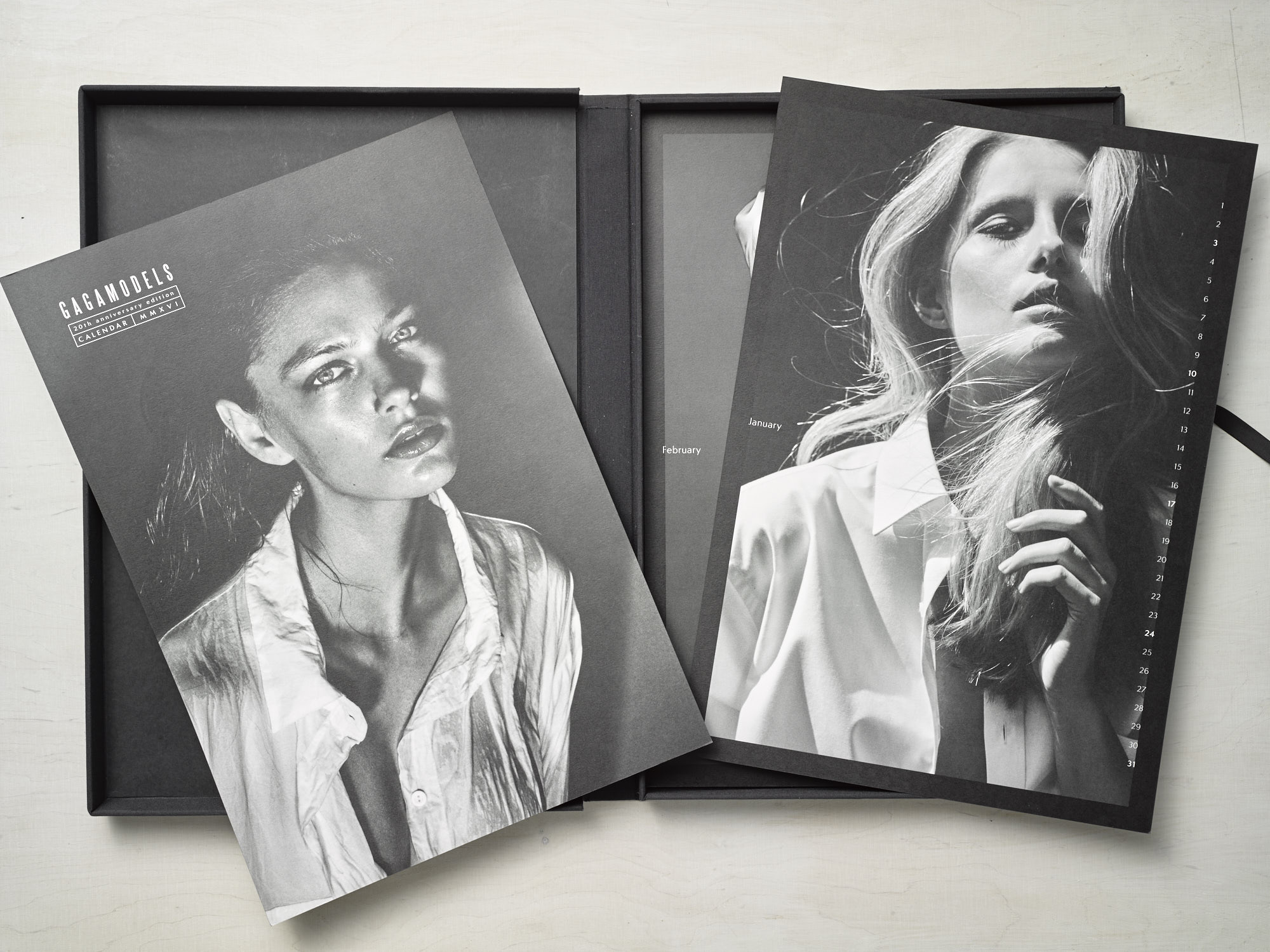
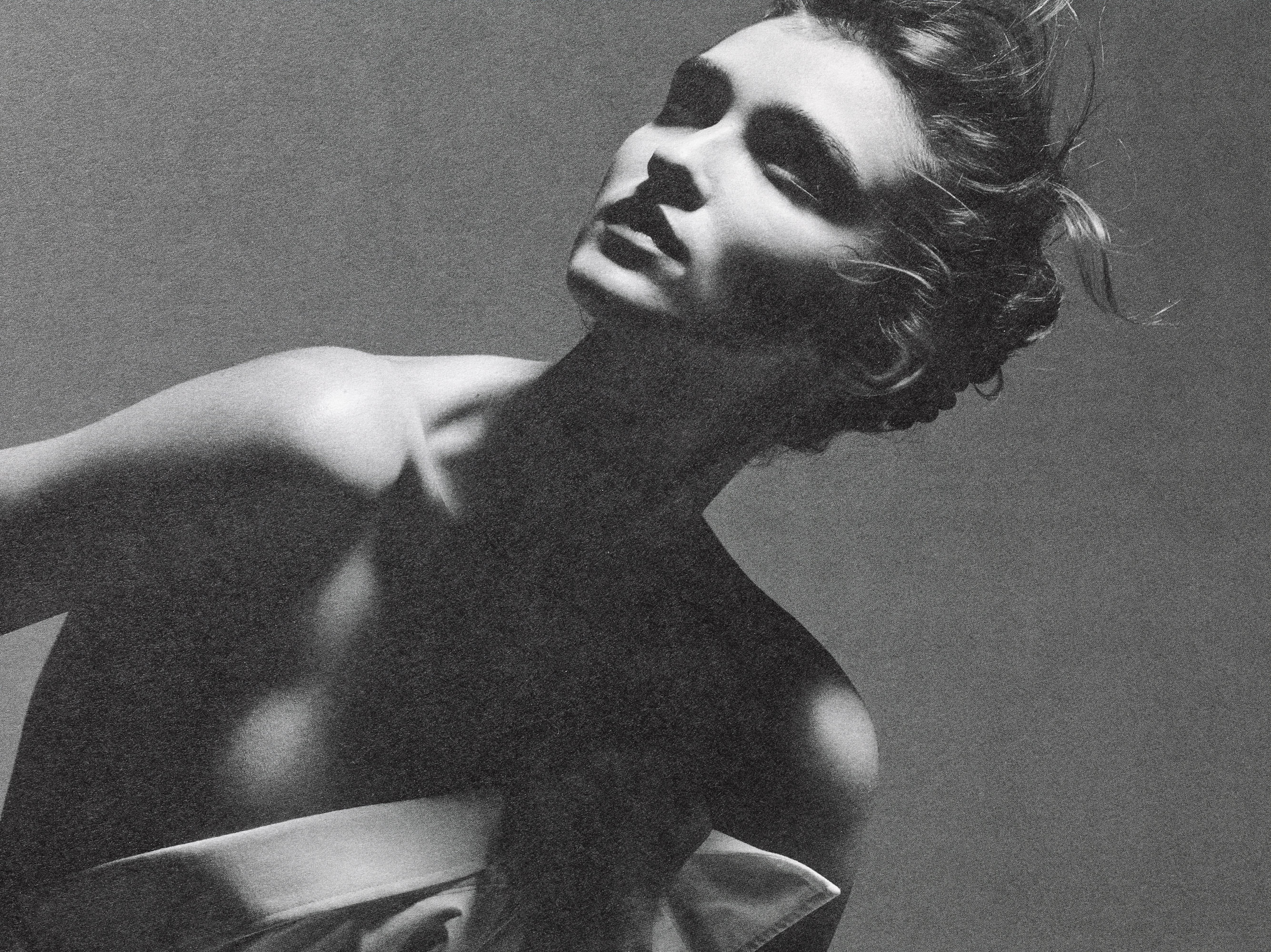
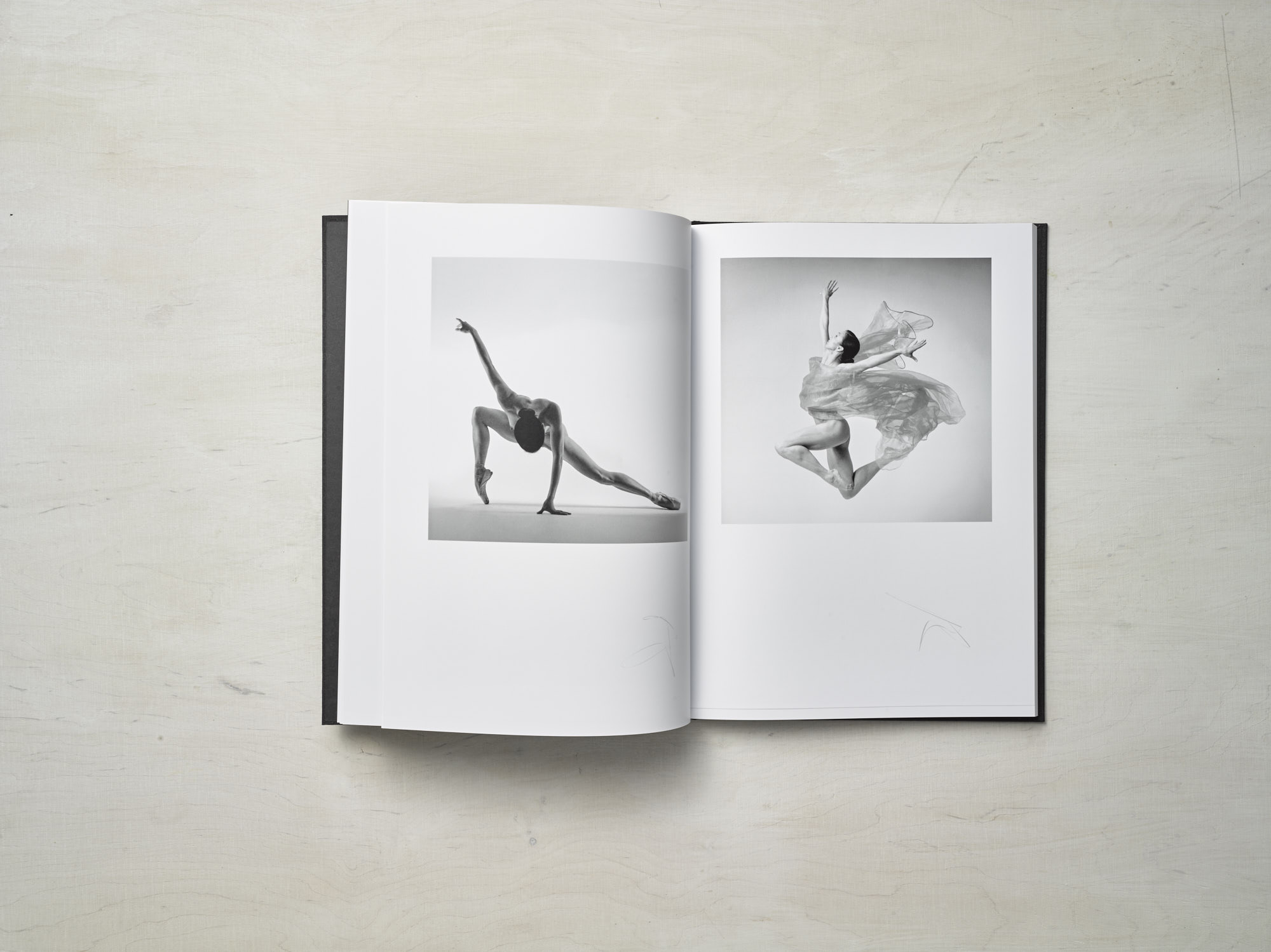
This is how it all began. Darkroom blow-ups, which in time were transformed into prints. Starting with 2007 I can boldly admit that 90% of all my work is printing photography: starting with exhibitions, through single prints in smaller size and with high-end album production. I deal with full pre-press with interpolation, sharpening and separations. In case of album production I’m also responsible for bindery.
reproductions
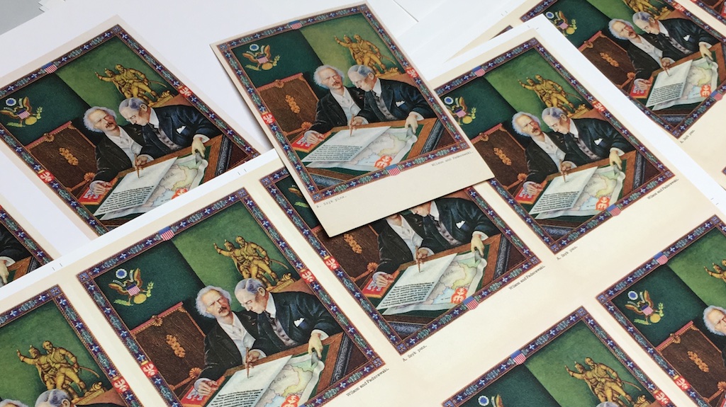
My first practical contact with reproduction of art was when I started printing facsimile. Very soon it turned out that this is type of work that aggregates my complete knowledge around high quality imaging. Full process contains image analysis, proper separations, preparation of individual screening and often also mixing special inks. And all of those are part of my job.
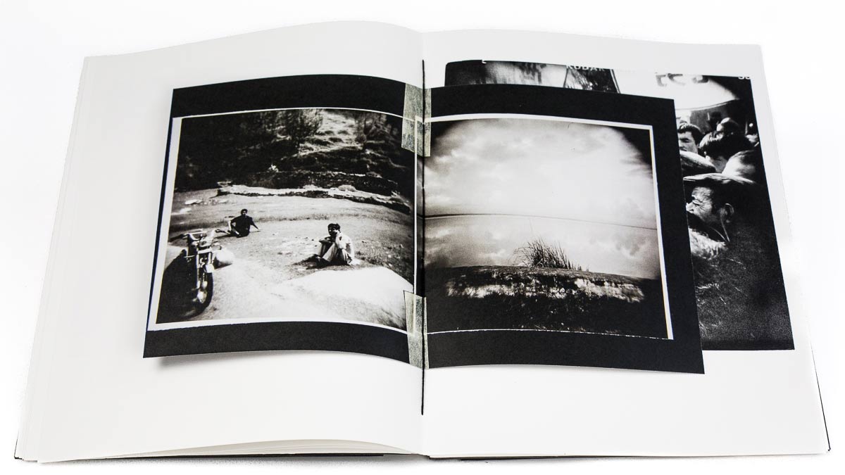
portfolio
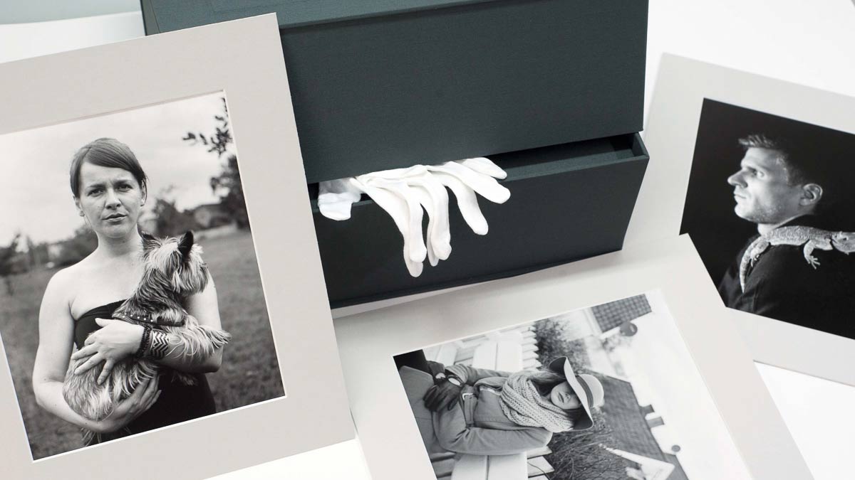
Presentation of artists achievements starts way before even opening a folder or box with prints. It’s one of those situation when bindery does matter. I deliver ready art-works for artists that requires hand bindery and printing with prior preparation.
proofing, control & mockups
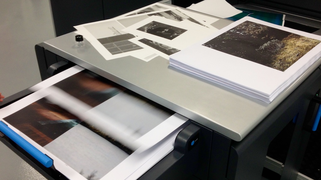
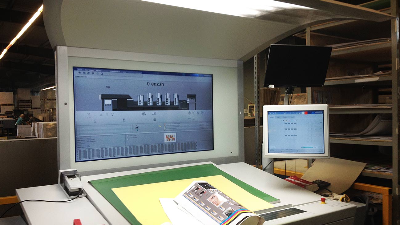
It’s good to see rather sooner what will be printed in larger volume. It’s not just about colour or typos, but also about overall project perception. I make mockups and proofs on designated substrate used in target production. Also on clients behalf I’m overseeing print process in foreign print houses.
hq printing
photography & reproductions & albums
However we are going to call it: photo printing, high quality printing or HD printing – if we are thinking about it seriously good equipment is still not enough. Creating similar look & feel in different printing techniques like ones used in album or exhibition requires making completely different output files. I change resolution, make individual gamut and tonality mapping, create new way of separations using different inks. There’s no easy step-by-step recipe.
Image cannot be technical. In order to achieve this you need to paradoxically walk through a lot of processes and technological boundaries. This is a place where I feel in home.
perfect colour,
right colour
Numerical data of colours in photography are often meaningless. They are absolute, but we are looking at pictures that are relative: in a certain frame, shade of substrate, photographs near by or colour of a wall that blow-up is hanging.
But when it’s a case about art reproduction, colour must be spot on and still natural – NOT artificial. It’s not only about colour value but also a was it’s being created. For example how much black we are going to use in a process.
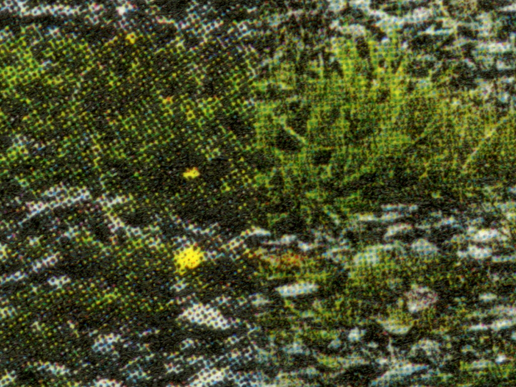
5ch & 7ch printing
Multichannel printing became fashionable. Does it mean that the more, the better? Not always, but here – rather yes. By implementing additional channels for midtones like grey or light cyan / light magenta we can make to print look so much smoother almost without any grain or noise. But when I was creating 5ch and 7ch printing my target was improving colour stability relatively to light and achieving more neutral grayscale prints. Everything that I print – I make it using my own colour separation techniques.
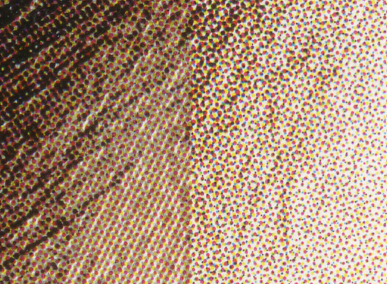
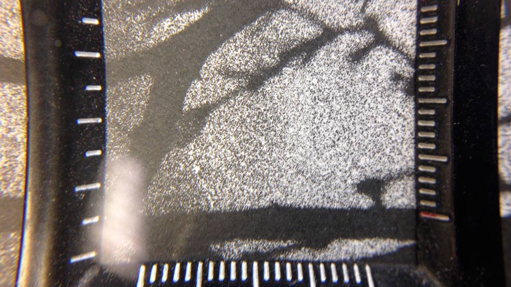
Picture above illustrates special screen imitating analog film grain (silver halides). On bottom you can see comparison with individual design screening.
the highest level of details
In lithography we can make any choice of screening and by that way of representing halftones. But it’s also often for other printing techniques that screening is strictly limiter to one without possibility of changing it. I deal with conscious choosing of proper screening including it’s design and usage of my own screenings both in digital and lithography.
This is a moment when we talk about natural appearance of printout and it’s shape. We make it to look “pretty” and “pleasant”. Although effect evokes emotions – road to achieving it is highly technical.
special ink matching
duotone & tritone
On the contrary what’s been said: printing of B&W photography is the hardest one. And no, I’m not using just black ink to do it. Although there are situations of printing multiple black channels. But…
Colour is not wanted, because it always involves with putting hue to the print. If not in this then in other lighting conditions. Black is to dark for bright tones, that’s why I’m starting to build image with light inks going smoothly into darker ones until I’ll reach deepest shadows. It’s called multitone printing and matching shade of grey inks as well as their brightness is not a trivial task. But hey! How fascinating it is.
proofing
sheets, complete mockups & printing oversee
proof
Once there were cromalins. World has evolved “a bit” and I must admit that word “proof” in printing industry has been used to often. I create proofs created on target substrate with simulation up to 97% of Pantone Solid Coated / Uncoated colours. Because what’s the point of creating “proof” on thick coated substrate when target volume will be done on thin, rough and uncoated paper?
mockups
Printing 1:1 is a one thing, but when we’ll see it in bindery of our choosing then all details will be brought to surface. Creating complete mockups is very valuable not only technologically but also can help visualise our concept to other project members or potential sponsors.
print control
This is the offer for graphic & design studios, brand managers that are ordering prints in printing houses and they care about keeping up to all given requirements. By having accepted proof in my hand I’m capable to participate in printing and all next processes approving them on your behalf. It’s just like you’ve been there by yourself.